OpenForms subscriptions

The challenge
When the OpenForms form builder was first released, it was treated as an add-on to our OpenCities site builder. It was offered only to clients we already had a relationship with, there was no marketing effort behind it, and we weren’t charging for it consistently.
In 2018 we undertook a project to make a SaaS version of OpenForms available to the public — it would allow us to offer a range of plans to suit differing user needs, expose us to new market sectors, and let users get started right away without any human interaction. It would also allow us to standardise how existing clients were paying for OpenForms.
To get there, we needed to introduce a whole bunch of functionality. The biggest? A new subscription flow that allowed people to visit our new marketing site, sign up for a trial, choose a plan at the end of it, get charged automatically, and manage their subscription directly from OpenForms.

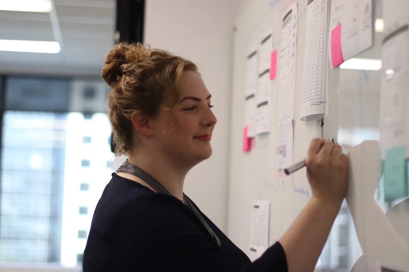
The Plan screen for the new subscription flow
My role
Wrote or reviewed all UI and marketing content
Collaborated with experience design lead and business analyst on UX design
The process
Because this was such a complex flow with so many variants — four subscription levels, both free trial users and paying users, downgrade and upgrade processes — there was a lot of work we needed to do upfront to map out the user journeys and make sure we were accounting for all scenarios.

A flowchart created by our business analyst for the plan upgrade and downgrade process
I collaborated with our user experience lead and business analyst on how we should group information (and therefore organise our screens), and what communications (both in-product and email) would be needed along the way.
Me annotating the user flow with questions and wording changes
Additionally, I researched how other SaaS products went about their subscription flows, and collected examples of the ones that seemed to be getting it right — particularly from a content perspective.
The solution
Keeping trial users in the loop
We wanted to make sure users completing a trial always understood how long they had left, and what their options were for moving to a paid trial.
We introduced a banner that would remain at the top of the screen throughout the trial, and cycle through a series of messages depending on how many days in users were.
Because there was such little screen real estate to play with, I had to keep the wording short and sweet, while also making sure I’d told trial users everything they needed to know.

The ’30 days left’ message for trial users
We also assigned a design system component to each message. This would change the style and colour to reflect the level of urgency of the information.

A matrix of trial messages + their design system components
Wrangling the content
There was a whole lot of information we needed to convey on each screen. The challenge was retaining a clean and simple look while still providing the necessary details.
We also needed to think about upsell opportunities. For example, if a user tried to add more gigabytes of storage than their current plan would allow, that was a chance for us to remind them we had more feature-rich plans that might better suit their needs.

Using hierarchy and some super concise UX writing to cram a whole lot in
Setting clear expectations
This was a multi-step flow, so we wanted to ensure users always knew where they were within the bigger picture. I suggested adding additional context to our button labels, so instead of Next, we’d always show something like Next: Change add-ons or Next: Confirm changes.
This was especially important because users would be making payments within the flow. It needed to be crystal clear when they would be charged.

Making it clear that there’s still a confirmation step to come before users will be charged
Making sense of a messy downgrade process
If a user chose to downgrade their plan, there were quite a few ways in which their account could be impacted. We needed to be clear on what would happen with their data, and what options they had to mitigate potential losses.
I suggested that we include a single page that summarised this info, and that we also email it to users so they could continue through the flow without distraction, and refer back to the info in their own time.

Most downgraders would (thankfully) only see a subset of the items on this info-dense page
Creating emails to support the flow
We needed over 30 new emails to support the subscription process, covering things like account verification, trial status, upgrades and downgrades, subscription payments and more.
These would be sent by the system to users at certain points in the flow. It was my job to write these, and work with developers to implement them.

One of the upgrade emails I wrote for the new flow
Marketing language that matched the product
We needed content for our new marketing site to promote each of the plans along with each of the features within those plans. I worked with our marketer to come up with short blurbs for each feature, making sure they reflected the language we used to refer to those features within both the product interface and the help centre.

Page for the Pro plan on the OpenForms marketing site
The results
We were able to successfully move all our existing clients onto a subscription level that suited them. All new users who have signed up since the SaaS launch have been able to sign up for a trial, choose a plan at the end of it, get charged automatically, and manage their subscription directly from OpenForms with minimal bugs or issues.